


On my daily brisk autumnal walk to the shops this morning with This Charming Man bouncing around the insides of my head, creating a sense of pleasure and introspection, two things struck me. Firstly, Morrisey’s poignant, intelligent and exposing lyrics on gay culture in the 80s are sublime: “Punctured bicycle, On a hillside desolate, Will nature make a man of me yet?”; and secondly, what the actual fuck is going on with the Cerebos Salt logo?
Now, while the first observation may seem explainable: I was listening to The Smiths classic when lying in bed, with the sun streaming through the window, newspapers (well, Twitter) in hand. “Ah ! A jumped-up pantry boy”.
The other is a little odd and its revelation is linked to another observation: walking your neighbourhood connects you with it. Neighbours and their gardens become real and not abstract concepts that we speed past before entering the confines of our own property, and we are made aware of the most beautiful minutiae of suburban life: the flowers; the house numbers and their individuality, from the minimalist to the outlandish to the practical to the overtly gaudy; the small home improvement projects and the sounds of early morning activities taking place on the other side of walls. When walking the neighbourhood, community starts looking like a good thing.
Despite this, my attention was drawn to the gutter (I wouldn’t read too much into that), where nature was competing with mankind: fallen leaves being squashed by the litter scattered down the road by careless garbage collectors who weekly remove the reality from our Stepford Wives fiction, so we can pretend that the problem doesn’t exist.
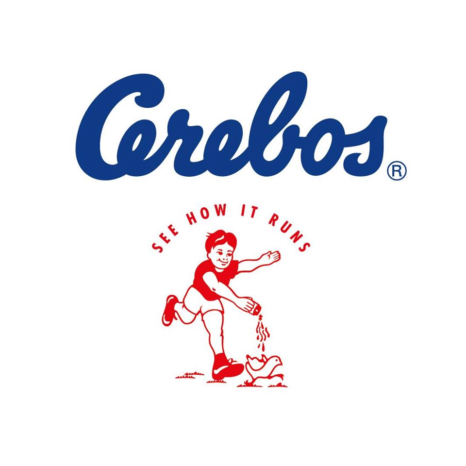
One piece of litter caught my eye: an empty Cerebos salt packet. The object itself was unremarkable and was lying amid Covid-19’s contribution to the litter scene: used gloves and masks (as always there is trade-off between living and saving the planet). What I did find remarkable was the product’s extremely bizarre branding, which was not only confusing but also, a monument to anachronism. The logo is a simple drawing of a boy chasing a chicken and pouring salt over it. The slogan accompanying this depiction of perfectly normal daily modern-day activity is: “See how it runs”.
Just to make sure we are clear and all understand: the logo is a simple drawing of a boy chasing a chicken and pouring salt over it.
Before we get on to just how bizarre that really is, let’s look at the vaguely justifiable: the slogan. Cerebos started selling its product in a time when salt was sold in large blocks and users scraped off the required amount. Then the company added anti-caking agents to the salt, and, the salt became free running, hence: “See how it runs”.
The salt revolution both began and ended on this fine day.
This, by the way, was in the 19th century and, unsurprisingly, the company hasn’t come up with a more slogan-worthy achievement. They have, however, stubbornly stuck to the words and I am confident that I am not the only one who thinks of visually impaired rodents when I read or hear the slogan.
So, back to the image of the once apparently innocent and now obviously masochistic behaviour depicted in the logo. Looking at this image makes my head hurt more than even the most ostentatious and wilfully morose Smiths song. Looking past the fact that there has been no modernisation to the logo and the boy looks like he was copied and pasted (well, you know, the 19th century equivalent) from the cover of an Enid Blyton book, his activity is extremely baffling, certainly to these modern eyes.
Why, for the love of poultry is a small child assaulting a poor chicken with a condiment?
My first thought, bizarrely, was that some sort of pre-seasoning seasoning was going on. A way in which to season the bird prior to slaughter, plucking and roasting. If so, that’s a level of dedication that would make Heston Blumenthal blush and I strongly suggest that he investigate the matter to perfect the art of the roast chicken, which he thought he already had – if only he had paid more attention to salt labelling. Then, I thought that perhaps I was simply an ignorant city slicker and that chasing poultry around the farmyard with salt was a common form of boyhood revelry. If so, this seems both wasteful and cruel, and not really a lot of fun – presumably you need to stop every few metres to throw salt over your shoulder. Incidentally, I always thought this was a Christian belief and had something to do with Lot’s wife being turned into a pillar of salt, but I was, as I so often am when it comes to the biblical, wrong. No, it turns out the superstitious powers of salt are only slighter older, certainly in the European tradition, than the Cerebos logo, dating back possibly to ancient Rome. That bloody, clumsy uber-villain Judas Iscariot is portrayed as having knocked over the salt in da Vinci’s The Last Supper (that should have been a warning to Jesus). Interestingly, the salt ran out the salt shaker, even without Cerebos’s industry-changing,-see-how-it-runs invention. Never trust a man who can’t pass the salt effectively.
Back to the masochistic boy. Clearly I have no idea about the meaning behind the logo – but that’s what we have the Oracle for and a fairly in-depth internet search will undoubtedly educate me. Googling: “Do people chase chickens with salt?” was never really something I expected to need to do, but then we live in a world where we need to tell people to not drink bleach despite suggestions to do so by the President of the United States. Remarkably, I found nothing that supports the depicted behaviour and the company’s website simply hints that it is all part of the “see how it runs” philosophy. In the case of the chicken, it runs with life-threatening fear. I did discover, in a spicy twist of irony, that salt is not particularly good for a chicken and neither is chasing it around and pouring chemicals over it.
Is this where the sinister and bizarre ends? I am not so sure. The Cerebos logo is clearly iconic, but if see it as iconography, we can’t ignore the messaging behind the image of the boy. Images and logos tell a story beyond what they immediately show us, and this boy tells a dark story. Through his clothing, boots, hairstyle and most importantly the style and composition of the drawing, this is a homage to bygone days. Bygone colonial days that saw images of this style being used in what are now seen as racist, misogynistic and xenophobic books and magazines. It is clear that the boy in the Cerebos logo would not look out of place on the cover of Enid Blyton’s The Little Black Doll. Now, maybe this is all a woke step too far and of course Cerebos are not being racist, misogynistic or xenophobic in using this image, but, whether it is my white guilt, my sensitivity, or my love of iconography, looking at the image makes me feel very uneasy indeed.
I would strongly suggest that Cerebos relooks its branding. It is one thing to be loyal to tradition and another to not evolve with the times, otherwise they may just end up like Morrissey, once, a beacon of liberal 80s counter culture morality and now a cantankerous hot-head who embraces the far right and bemoans immigration.
Heaven knows I am miserable now.
Author

A prince with dignity and determination
Prince Ngarambe’s goals are to become Rwanda’s first transgender model and to uplift the country’s youth

The EFF’s principles are unshakeable
Unlike the ANC, the core values of the freedom fighters do not change with each leader it elects