


We’re really proud to announce the next step in our digital journey at FNB — the launch of the brand spanking new website.
The website relaunch has been a project of mammoth proportions, with amazing collaboration between teams from all over the bank. As I blog this, the guys from the online team are still baby-sitting the launch — big kudos on the effort.
From the very beginning, we started out with a couple of lofty strategic ideals centred around the customer experience.
It had to be:
* An Experience (a bank website just isn’t the must-visit destination other sites can claim to be — our visitors are purpose-driven and we have to work hard to provide an environment that promotes exploration and feels like an experience).
* Friendly (it’s something I’ve been talking about for ages, the big lesson that Web 2.0 has taught us is to talk WITH people, not talk AT them — something I think we’ve really achieved)
* Intuitive (banking products can be complicated — we had to find a way to logically group them according to a flow that customers would relate to — the I Want to BANK approach is that)
* A bit 2.0ey (you can’t be obsessed with the open-everything Web 2.0 approach, remember we’re a financial institution and trust is paramount — but there are some 2.0 lessons that you can see coming through: the personalisation mentioned below, the rounded edges, soft design, AJAX elements on the Wizards and navigation structure)
* Personal (there’s much more to come in this space, but you can see elements of personalisation in the My Menu option — it’s amazing what just pulling your name into search results does for the experience as a whole)
More visual more often
When I was doing research in the beginning stages of the product, it blew me away how few bank websites (even international examples) bothered to show a picture of the product. A platinum credit card is a sexy product, it’s a status symbol and something you use almost daily. Yet no pictures?
A strong focus in the project was to find a way of visualising products and their associated features and benefits. This follows a big international trend towards a more retail style of financial-services sites. Amazon has set a benchmark, and there’s no shame in trying to match it.
If you look at a product page (Platinum Credit Card is my personal favourite) you can see how the simple use of images to illustrate benefits really turns this into a sexy experience …
It’s all about conversions.
And, at the end of the day, what is a website around for? It’s your digital front door, your virtual sales consultant … If people can’t get your products or get in touch with you, you’re failing from the start. The lead form on the page (Click CALL ME BACK on any of the content pages) and the new Product Shop are moves in the right direction.
Make it easy for customers. Full stop.
The new site was a massive team effort — thank you and congratulations to everyone involved. We hope you, the public, see where this dream is going and enjoy the new experience. This is just the first step … Finance on the web. Now with added friendliness.

A prince with dignity and determination
Prince Ngarambe’s goals are to become Rwanda’s first transgender model and to uplift the country’s youth
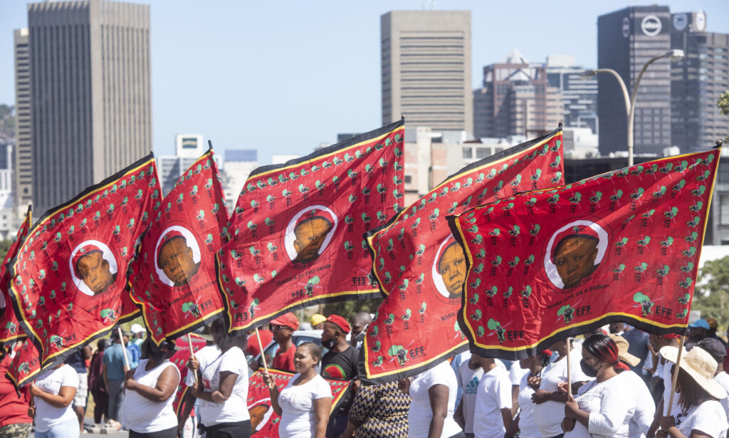
The EFF’s principles are unshakeable
Unlike the ANC, the core values of the freedom fighters do not change with each leader it elects