


 The famous Australian based web community site Sitepoint, originally founded in a roundabout way in 1997, launched its “new look” front page this week. A pretty mixed response it has received, and as I often tend to do, I’ll try to remain as unbiased and neutral on the topic for the time being.
For those that don’t know Sitepoint, it’s a webmaster’s resource covering everything from content origination through to managing your site. I frequent the business and legal issues forums as well as a number of other design and code related sections. Full of seasoned professionals and a sprinkling of egotistical newbies, if you choose to regard the answers to your questions carefully, you should gain some insight into the topics you seek information on.
This is how they define themselves:
SitePoint is a fast growing online media company and information provider targeting the Web professional market, specifically Web Developers and Designers. The company has five major revenue streams: advertising and sponsorship, content-based products both online and in retail, software, and more recently streaming video subscriptions and classified listings.
Now, not to go too far off topic, like I stated, they’ve recently launched their new look… but only on their front page. An odd decision by my thinking, but perhaps there is method in the madness. Possibly the rollout is a scheduled, phased approach, and I guess only time will tell.
I’ve been an avid reader and contributor to the community since August 2004 and was an anonymous spectator for a while before that. It’s helped me a lot with what I know and I’ve bought a few of their books, and one of their kits. I have their handy CSS Quick Reference Guide on my wall above my screen and (shock horror!) I wear one of their bright orange t-shirts (on washing day only now).
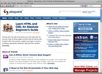
Stay on topic Ross! Sheesh, I lose it sometimes. The design. What do I think of it? Well, I think it’s pretty nice. Clear, clean, and good use of focal points. Not too ecstatic about big fat sans-serif headers, but as is the nature of the beast, I’m sure it’ll grow on me. The smaller illustration for the featured article is a plus. I never did think much of their illustrations. Compared to those on Alistapart they look like they were done by a child… sorry.
The max width application (the fact that the content area scales, but only to a certain width then fixes) is a definite plus too, and the fact that the blue bar continues to the edges looks great. All in all, the page’s information architecture is greatly improved, although I’m sure a lot of people will disagree, and some have. Factors like that the content areas aren’t in blocks anymore (hanging loose) seem to make some feel a bit lost. Personally I think some whitespace is better than a box… usually.
Sitepoint’s own Matthew Magain has written 7 reasons why the new design rocks and they’re listed as:
- News is front and center.
- We’ve got Josh Catone. (Yes, the Josh Catone!)
- It’s fresh.
- It’s clean.
- It speaks to each of our audience groups.
- We’ve got lists.
- We’ve still got all the other stuff.
In his defence, he does start out by saying that he knows that it’s almost begging for a list of reason why it sucks, and you have to almost admire his brashness.
If you know Sitepoint, it would be nice to hear what you think… or if not, your opinion will still add value to any discussion on the new design.

A prince with dignity and determination
Prince Ngarambe’s goals are to become Rwanda’s first transgender model and to uplift the country’s youth

The EFF’s principles are unshakeable
Unlike the ANC, the core values of the freedom fighters do not change with each leader it elects